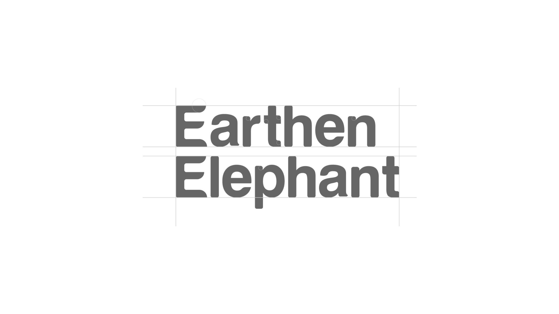
Font Refinement
I’ve strategically chosen the Swiss721 BT font, and to enhance its friendliness and connection to nature, I’ve implemented changes. Specifically, I’ve rounded the corners and introduced subtle curvature to characters like ‘a’ and ‘e.’ These adjustments not only impart a welcoming feel but also align with nature-inspired elements, creating a graceful resemblance to leaves.
